
 English
  Español

-
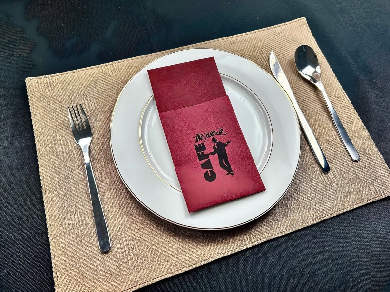 View moreWhat Factors Should You Consider When Choosing Colored Airlaid Napkins for Your Restaurant?Introduction In the hospitality industry, presentation plays a significant role in creating a memorable dining experience. One often overlooked element is the napkin, which serves both a functional and aesthetic purpose on the dining table. Among various napkin types, colored airlaid napkins have emerged as a popular choice due to their versatility, durability, and customization options. Whether you’re managing a fine-dining establishment or a casual bistro, understanding the factors that influence your choice of colored airlaid napkins can help elevate the overall guest experience. Durability and Quality The durability of napkins is crucial in a high-turnover restaurant setting. Colored airlaid napkins, known for their strength and resilience, can withstand frequent use without tearing or losing their shape. Unlike traditional paper napkins, airlaid napkins are made from a unique process where air is used to bond fibers, creating a fabric-like texture that offers both strength and softness. Factors to Consider: Thickness: Thicker napkins generally last longer and can absorb more moisture, making them ideal for both casual and formal dining settings. Washability: Consider whether the napkins can be reused or are disposable. Colored airlaid napkins are often designed for one-time use, but their higher quality allows for some flexibility in washing. Aesthetic Appeal One of the key reasons colored airlaid napkins are favored in restaurants is their aesthetic appeal. Available in a wide range of colors and textures, these napkins can complement your restaurant’s theme or branding. Choosing the right color can influence the ambiance of the dining space and enhance the overall dining experience. Key Points to Consider: Color Scheme: Select napkin colors that match or contrast with your restaurant’s interior design. For example, bold colors may work well in modern, trendy eateries, while neutral tones may suit more classic settings. Texture: Colored airlaid napkins are available in various textures that can elevate the visual appeal of the table setting, from smooth finishes to more textured surfaces that add depth. Customization with Hot Stamping For many restaurants, branded or customized napkins add a personal touch that helps set them apart from the competition. Hot stamping is a popular technique used to add logos, monograms, or other design elements to colored airlaid napkins. This process uses heat to apply metallic or colored foil onto the napkin’s surface, creating an elegant and long-lasting design. Advantages of Hot Stamping: Branding: Add your restaurant’s logo or a specific message to your napkins, helping to strengthen brand identity. Customization: Hot stamping allows you to choose from a wide array of colors and foils, giving you the flexibility to create a unique napkin design. Durability: The hot stamping process ensures the design remains intact even after multiple uses, adding long-term value to your napkin investments. Environmental Considerations As sustainability becomes an increasingly important factor in the hospitality industry, many restaurants are opting for eco-friendly solutions. While colored airlaid napkins are typically disposable, they can be more environmentally friendly than regular paper napkins due to their higher quality and strength, meaning they are less likely to contribute to waste. Eco-friendly Considerations: Biodegradability: Ensure that the napkins you choose are biodegradable to minimize environmental impact. Recycled Materials: Some manufacturers offer colored airlaid napkins made from recycled materials, allowing your restaurant to align with sustainability practices. Cost-Effectiveness While colored airlaid napkins may come at a higher initial cost compared to traditional paper napkins, their durability, aesthetic appeal, and customization options make them a cost-effective choice in the long run. Restaurants can reduce waste, enhance the customer experience, and minimize the need for frequent replacements. Cost Considerations: Quality vs. Price: Balancing quality and cost is crucial. While premium options like hot stamping may add to the cost, they can help create a unique dining experience that justifies the expense. Volume Discounts: Many suppliers offer bulk purchasing options, which can help reduce the per-unit cost of your colored airlaid napkins. Table Setting and Presentation The role of napkins in table settings goes beyond practicality; they contribute to the overall presentation. Colored airlaid napkins can be folded into various shapes or paired with napkin rings to enhance your table design. By investing in high-quality napkins, you can elevate your restaurant’s appearance and create a sophisticated atmosphere for your guests. Table Setting Tips: Folding Styles: Consider different folding techniques that complement the type of service your restaurant offers. For example, formal restaurants may opt for intricate folds, while casual dining settings might prefer simpler designs. Napkin Rings: Pairing your colored airlaid napkins with stylish napkin rings can further elevate the presentation. Practical Use in High-Traffic Areas Napkins in high-traffic areas such as buffet lines or quick-service restaurants need to withstand constant handling. Colored airlaid napkins, due to their higher durability, are well-suited for these environments. Their ability to handle both moisture and wear and tear makes them ideal for fast-paced restaurant operations. Conclusion Choosing the right colored airlaid napkins for your restaurant involves considering a variety of factors, including durability, aesthetic appeal, customization options, and sustainability. With their superior quality, design flexibility, and practical benefits, these napkins can elevate your dining experience while maintaining cost-effectiveness in the long run. Whether you’re looking to add a personal touch through hot stamping or create a cohesive table setting, colored airlaid napkins offer numerous advantages for any restaurant. FAQ 1. What are colored airlaid napkins made of?Colored airlaid napkins are made from a nonwoven fabric created through an air bonding process, which provides durability and softness. 2. How can hot stamping enhance my napkins?Hot stamping allows for the addition of metallic or colored foil designs, logos, or text, providing a unique and personalized touch to your napkins. 3. Are colored airlaid napkins eco-friendly?Yes, many colored airlaid napkins are biodegradable, and some are made from recycled materials, making them an eco-friendly option. 4. Can I wash colored airlaid napkins?Most colored airlaid napkins are designed for single-use, but some high-quality varieties may withstand gentle washing depending on the manufacturer.2026-03-19+
 -
 View moreWhat Are the Key Benefits of Airlaid Napkins Over Other Disposable Options?The growing demand for sustainable, high-performance, and convenient disposable products has led to the rise of airlaid napkins. These nonwoven, highly absorbent napkins have become increasingly popular in the food service and hospitality industries, outperforming other disposable options in various aspects. Introduction Disposable napkins are essential in various settings, including restaurants, hotels, events, and catering services. They provide convenience and hygiene, essential in high-volume environments. Among the many types of disposable napkins available in the market, airlaid napkins have gained attention due to their superior qualities. This article delves into the unique features of airlaid napkins and their advantages over other disposable napkin alternatives, such as paper, spunlace, and tissue napkins. What Are Airlaid Napkins? Airlaid napkins are made from airlaid nonwoven fabric, a process that involves using air to disperse fibers, which are then bonded together to create a thick, soft, and highly absorbent material. This process ensures that the napkins possess high strength and durability, offering an ideal option for both absorbency and aesthetic appeal. Key Benefits of Airlaid Napkins Superior Absorbency and Performance Airlaid napkins are renowned for their absorbency, which outperforms many traditional paper napkins. The airlaid process allows for a more even distribution of fibers, creating a dense, uniform texture that absorbs liquids effectively. This makes airlaid napkins particularly ideal for high-traffic settings like restaurants and catering events, where spills and messes are frequent. Feature Airlaid Napkins Paper Napkins Spunlace Napkins Absorbency High Moderate Moderate Softness Soft Varies Soft Durability High Moderate to Low Moderate to High Enhanced Comfort and Softness Unlike other disposable napkins that may feel rough or stiff, airlaid napkins are known for their luxurious softness. This texture is particularly appreciated in settings like fine dining or events, where guest comfort is a priority. The smooth surface makes them ideal for wiping the face and hands, ensuring a pleasant experience for guests. Eco-friendly Option In an age where sustainability is crucial, airlaid napkins offer an eco-friendly advantage. Made from wood pulp or recycled fibers, these napkins are biodegradable and can break down more quickly than synthetic materials. The absence of chemical bonding agents, commonly found in other disposable napkin types, adds to their environmentally friendly nature. Many manufacturers are also focusing on increasing the percentage of recycled materials used, making airlaid napkins a top choice for eco-conscious businesses. Durability and Strength Airlaid napkins are designed to be durable, often stronger than paper or spunlace napkins. This makes them suitable for tasks that require more than just simple absorption. Whether it’s cleaning up liquid spills, wiping greasy hands, or even handling wet surfaces, airlaid napkins provide a sturdier option without tearing easily, unlike paper napkins that can fall apart with minimal effort. Variety of Designs and Customization One of the key selling points of airlaid napkins is their ability to be customized. Manufacturers can easily produce napkins in various colors, textures, and designs, allowing businesses to create a distinct brand identity. Whether used in a formal dining setting or a casual event, airlaid napkins can be adapted to meet the aesthetic needs of the establishment, adding an elegant touch to any table setting. Hygienic and Safe Airlaid napkins are an excellent option for foodservice businesses, where hygiene standards are strict. The nonwoven structure minimizes the chances of bacteria growth, as the fibers do not trap moisture in the same way that woven materials might. Furthermore, airlaid napkins are often manufactured in clean, controlled environments, ensuring they are free of contaminants, making them a safe and hygienic choice for customers. Cost-Effectiveness in the Long Run Though airlaid napkins might have a higher initial cost compared to other disposable napkins, they can prove to be more cost-effective in the long run. Their durability means they are less likely to tear or wear out during use, reducing the frequency of replacement. Moreover, the enhanced absorbency ensures that fewer napkins are required for a task, ultimately reducing overall consumption. Airlaid Napkins vs. Other Disposable Napkins To fully understand the advantages of airlaid napkins, it’s important to compare them with other common types of disposable napkins available on the market. Paper Napkins Traditional paper napkins are widely used due to their low cost and widespread availability. However, they are often less absorbent and can tear easily. Paper napkins may also have a stiffer feel, which can be less comfortable compared to airlaid napkins. While biodegradable, paper napkins often require more napkins per task, making them less efficient than airlaid options. Spunlace Napkins Spunlace napkins are made by bonding fibers together through a water-based process. They offer a softer feel than paper napkins and are generally more durable. However, airlaid napkins still have the edge in terms of absorbency and strength, making them the preferred option for more demanding applications. Spunlace napkins can also be more expensive than paper napkins, though they are still generally more affordable than airlaid napkins. Tissue Napkins Tissue napkins are another popular disposable option, commonly used in fast-food chains and other casual dining establishments. They are lightweight, but they often lack the absorbency and strength of airlaid napkins. Additionally, tissue napkins can disintegrate quickly when wet, making them less effective for cleaning or wiping up large spills. Environmental Considerations With environmental concerns becoming more pressing, many industries are shifting towards more sustainable products. Airlaid napkins, made from renewable resources like wood pulp, are biodegradable and decompose faster than plastic-based napkins. The lack of toxic chemicals used in production further enhances their eco-friendly credentials. As a result, airlaid napkins are becoming the go-to option for businesses aiming to reduce their environmental impact. Applications of Airlaid Napkins Airlaid napkins are versatile and can be used in a wide range of settings: Restaurants: Ideal for both casual dining and high-end restaurants, airlaid napkins enhance the dining experience with their softness and absorbency. Catering: Airlaid napkins are highly practical for catering services, as they offer both durability and aesthetic appeal for events of all sizes. Hotels: In hotels, airlaid napkins are often used in buffets, room service, and special events, providing both comfort and elegance. Corporate Events: For conferences, meetings, and corporate events, airlaid napkins add a touch of professionalism while maintaining practical functionality. Conclusion In conclusion, airlaid napkins offer a range of benefits that make them superior to other disposable napkin options. Their exceptional absorbency, softness, durability, and eco-friendly nature set them apart in the market. Whether used in the food service, hospitality, or event planning industries, airlaid napkins provide an efficient and hygienic solution for businesses aiming to meet both functional and aesthetic needs. FAQ 1. What makes airlaid napkins different from other disposable napkins?Airlaid napkins are made from nonwoven fabric, offering superior absorbency, softness, and durability compared to traditional paper, spunlace, or tissue napkins. Their unique manufacturing process ensures a more even distribution of fibers, resulting in a more effective and luxurious product. 2. Are airlaid napkins environmentally friendly?Yes, airlaid napkins are biodegradable and often made from renewable materials such as wood pulp. They break down faster than plastic-based napkins and are free from harmful chemicals, making them an environmentally responsible option. 3. Can airlaid napkins be customized for different occasions?Yes, airlaid napkins can be produced in various colors, textures, and designs, allowing businesses to tailor them to specific events, brand identities, or customer preferences. 4. Are airlaid napkins more expensive than other disposable napkins?While airlaid napkins may have a higher initial cost, their durability and absorbency make them more cost-effective in the long run. Fewer napkins are required for each task, and they are less likely to tear during use, reducing overall consumption. 5. Where are airlaid napkins commonly used?Airlaid napkins are widely used in restaurants, hotels, catering services, and corporate events due to their superior absorbency, comfort, and aesthetic appeal.2026-03-13+
 -
 View moreHow Do Cocktail Napkins Enhance the Guest Experience at Parties?Cocktail napkins are an essential element of any well-hosted gathering, elevating both the aesthetic and functional aspects of the event. These small, often understated pieces of fabric or paper, contribute significantly to the guest experience by ensuring cleanliness, comfort, and style during social events. As hosts, we tend to focus on the larger details such as the food and drinks, but cocktail napkins hold a vital, often overlooked role in ensuring a smooth and enjoyable occasion. The Role of Cocktail Napkins in Social Gatherings At any party, whether it’s a casual get-together, a formal event, or a corporate function, providing the right tools to guests enhances their overall experience. Cocktail napkins are designed for use in between sips of drinks, keeping guests clean and tidy while contributing to the mood and decor of the event. Their small size makes them perfect for holding cocktails or small appetizers, offering a functional yet aesthetic touch. Practical Benefits of Cocktail Napkins The practicality of cocktail napkins extends beyond their convenience in catching spills. For hosts, providing these napkins ensures that guests won’t worry about where to place their drinks or how to keep their hands clean. Hygiene and Cleanliness Paper cocktail napkins are particularly effective in maintaining cleanliness. Guests can use them to hold drinks, wipe their hands, or even dab at spills without the need for a larger cloth napkin, making them especially useful in more casual settings. Convenience for Guests Cocktail napkins provide a convenient, disposable solution for guests who are standing or mingling. They are designed to be portable, so guests can easily carry them around with their drinks. Square portable paper napkins offer the flexibility of use without feeling too cumbersome. Efficient Drink Handling By offering guests cocktail napkins, hosts ensure that guests can manage their drinks with ease. Whether it’s a glass of wine, a cocktail, or an iced beverage, the napkin absorbs condensation and prevents any mess from forming on tables or hands. Elevating the Ambiance with Eco Luxury Printed Cocktail Napkins In recent years, the demand for eco-conscious products has surged. As a result, many hosts opt for eco-luxury printed cocktail napkins, which combine sustainability with sophistication. These napkins are made from recycled materials or biodegradable fibers, helping to reduce the environmental impact of single-use items. With high-quality printed designs, these napkins serve not only as practical accessories but as decorative elements that contribute to the event’s theme. Whether it’s a floral pattern for a spring gathering or a sleek, minimalist design for a modern party, eco-luxury printed cocktail napkins add an extra touch of elegance. The Appeal of 2-Ply Cocktail Napkins The structure of a napkin plays a crucial role in its functionality. 2-ply cocktail napkins, which feature two layers of material, are more absorbent and durable than single-ply options. They provide a better experience for guests, especially when handling cocktails or messy appetizers. These napkins are versatile, with the ability to handle moisture, grease, and other common party messes. Durability 2-ply napkins are less likely to tear or fall apart when used, which means guests can use them with confidence. Whether it’s a slightly damp glass or a bit of food, a 2-ply napkin will absorb the mess without getting soggy or weak. Softness and Comfort Not only are 2-ply napkins practical, but they also offer superior softness. Guests will appreciate the comfort of holding a soft, high-quality napkin, making them feel more at ease during the event. This added touch can help to elevate the guest experience, making the party feel more thoughtful and well-executed. Versatility of Cocktail Napkins for Different Venues Cocktail napkins are suitable for a variety of venues, from private home parties to commercial establishments like coffee shops. For businesses, offering cocktail napkins such as eco luxury printed cocktail napkins or square portable paper napkins can create a refined and welcoming atmosphere. Guests at coffee shops, for example, may appreciate the neat presentation of these napkins alongside their beverages. Aesthetic Appeal of Cocktail Napkins The visual element of cocktail napkins shouldn’t be underestimated. High-quality cocktail napkins, especially those printed with unique or stylish patterns, can enhance the event’s decor. From intricate designs to simple yet chic prints, the napkins can match the theme and mood of the gathering, contributing to the overall ambiance. Customization For certain events, cocktail napkins can be customized with logos, names, or dates, adding a personal touch. This is especially common for weddings, birthdays, or corporate events where branded materials are in demand. These personalized napkins become keepsakes for guests, extending the impact of the event long after it has ended. Conclusion: Cocktail Napkins as a Small Detail with Big Impact Though small and simple, cocktail napkins are indispensable to any successful social event. They provide both practical benefits and aesthetic value, ensuring that guests are comfortable, clean, and impressed with the attention to detail. With a variety of options available—ranging from eco-luxury printed cocktail napkins to square portable paper napkins and 2-ply varieties—there’s no reason why hosts cannot elevate the guest experience through these humble yet important accessories. FAQ 1. What are the best types of cocktail napkins for eco-friendly events?Eco luxury printed cocktail napkins made from recycled or biodegradable materials are ideal for sustainable events. They offer both environmental benefits and stylish designs. 2. Can cocktail napkins be used in coffee shops?Yes, cocktail napkins are perfect for coffee shops, especially when serving beverages. Square portable paper napkins are ideal for these settings, offering both practicality and aesthetic appeal. 3. What is the difference between single-ply and 2-ply cocktail napkins?2-ply cocktail napkins are made from two layers of paper, offering superior absorbency and durability compared to single-ply options, making them more suitable for handling drinks and food. 4. How do eco-luxury printed cocktail napkins contribute to a party’s theme?These napkins feature elegant designs and patterns that can complement any party theme, adding an extra touch of sophistication and style to the event. 5. Are cocktail napkins suitable for both formal and casual gatherings?Absolutely! Cocktail napkins are versatile and can be used in both formal and casual settings. The variety of designs, from simple to luxurious, ensures they suit any occasion.2026-03-06+
 -
 View moreHow to Choose High-Quality Die-Cut Napkins: Material, Thickness, and Design Tips?When it comes to selecting the perfect napkin for various events and occasions, die-cut napkins have become increasingly popular due to their versatility and aesthetic appeal. Whether you’re organizing a wedding, a corporate event, or a casual gathering, the right die-cut napkin can elevate the overall ambiance. However, choosing the right one requires careful consideration of material, thickness, design, and other factors. Understanding Die-Cut Napkins: An Overview Die-cut napkins are a type of napkin that has been precisely cut into various shapes and designs using a die-cutting machine. Unlike regular square or rectangular napkins, die-cut napkins come in a wide range of creative and custom shapes, such as flowers, leaves, hearts, and more. This makes them an ideal choice for special occasions, as they offer both functionality and visual appeal. Choosing the Right Material for Die-Cut Napkins The material of the napkin plays a crucial role in its performance, texture, and aesthetic. Here are some common materials used for die-cut napkins: a. Paper Napkins Paper die-cut napkins are among the most popular choices due to their affordability and wide range of designs. They come in various thicknesses, ranging from single-ply to multi-ply, allowing you to choose the level of durability and absorbency you need. b. Linen-Like Napkins These are often made from a combination of paper and synthetic fibers to create a fabric-like texture. Linen-like die-cut napkins offer a more premium look and feel compared to regular paper napkins, making them ideal for upscale events. c. Cotton Napkins For those seeking a more eco-friendly option, cotton die-cut napkins are an excellent choice. They are reusable, durable, and can be washed multiple times without losing their shape or softness. d. Eco-Friendly Materials As sustainability becomes more important, many manufacturers are producing die-cut napkins made from recycled paper or bamboo fibers. These eco-friendly options are perfect for environmentally conscious consumers. Material Comparison Table: Material Durability Absorbency Texture Reusable Paper Napkins Moderate High Smooth No Linen-Like Napkins High Moderate Fabric-like No Cotton Napkins Very High High Soft Yes Eco-Friendly Napkins High Moderate Smooth/Fabric-like Yes Determining the Right Thickness for Your Needs The thickness of a die-cut napkin influences its performance, comfort, and aesthetic appeal. When choosing the right thickness, consider the type of event, the level of formality, and the nature of the food being served. a. Single-Ply Napkins Single-ply die-cut napkins are the thinnest and least absorbent. They are ideal for casual events or places where the primary purpose is decoration rather than functionality. b. Two-Ply Napkins Two-ply napkins provide moderate absorbency and strength, making them suitable for a wide range of events. They offer a balance between durability and comfort. c. Three-Ply Napkins Three-ply napkins are thicker and more absorbent, making them ideal for formal events or occasions where the napkin will be used for cleaning up larger spills or handling greasy foods. Thickness Comparison Table: Ply Absorbency Durability Ideal Usage Single-Ply Low Low Casual events, decorative use Two-Ply Moderate Moderate General use, versatile Three-Ply High High Formal events, messy foods Design Considerations for Die-Cut Napkins One of the primary benefits of die-cut napkins is the ability to create custom shapes and designs. When selecting a design, consider the following factors: a. Event Theme The design of the napkin should match the overall theme of the event. For instance, a wedding may feature intricate floral patterns, while a corporate event might opt for simple geometric shapes or the company logo. b. Size and Shape Die-cut napkins come in various sizes and shapes. When choosing a design, make sure it complements the size of the tableware and does not overshadow the other elements of the table setting. Popular shapes include flowers, hearts, stars, and circles, but custom shapes are also available. c. Color Color plays a significant role in setting the tone for an event. Bright, bold colors are perfect for casual or festive occasions, while muted tones like pastels or metallics are better suited for formal settings. d. Personalization Options For corporate events or weddings, you may want to consider die-cut napkins with personalized designs, such as custom monograms, logos, or messages. This adds a personal touch and makes the napkins more memorable. Design Comparison Table: Design Element Best for Key Considerations Floral Designs Weddings, Banquets Elegant and romantic Geometric Shapes Corporate events Clean, professional look Custom Logos/Monograms Weddings, Corporate events Personalized, memorable Bold Colors Casual events Vibrant and festive Price vs. Quality: Finding the Right Balance While die-cut napkins come in a range of prices, it’s important to find the right balance between cost and quality. Opting for a lower-priced option might result in poorer material or thinner napkins, while higher-end options may offer superior quality but at a premium price. When choosing die-cut napkins, consider the event’s budget and the expected number of guests. Purchasing in bulk may help reduce costs while still maintaining a high-quality appearance. FAQ 1. What is the difference between single-ply and two-ply die-cut napkins? Single-ply napkins are thinner and less absorbent, suitable for casual events, while two-ply napkins offer better durability and absorbency, making them a versatile choice for various occasions. 2. Are cotton die-cut napkins reusable? Yes, cotton die-cut napkins are durable and can be washed and reused multiple times, making them an eco-friendly option for events. 3. What is the most common material used for die-cut napkins? Paper is the most common material used for die-cut napkins, offering a wide range of designs and cost-effective options. 4. How can I personalize my die-cut napkins? You can personalize die-cut napkins with custom logos, monograms, or messages, which can add a unique and memorable touch to your event. 5. Are eco-friendly die-cut napkins durable? Yes, eco-friendly die-cut napkins made from recycled paper or bamboo fibers are durable and offer a sustainable alternative to traditional paper napkins. In conclusion, selecting the right die-cut napkin for your event involves considering material, thickness, design, and personalization options. By carefully evaluating these factors, you can ensure that the napkins not only complement your event’s theme but also meet functional requirements. Whether you are planning a small gathering or a grand affair, die-cut napkins can enhance the overall experience, leaving a lasting impression on your guests.2026-02-26+
 -
 View moreAre Airlaid Napkins Eco-Friendly? Exploring Their Environmental ImpactIntroduction In recent years, sustainability has become a central focus for both consumers and manufacturers. As people grow more environmentally conscious, they are looking for eco-friendly alternatives in various products, including everyday items like napkins. Airlaid napkins, which are made through a dry manufacturing process, have gained popularity for their softness and absorbency. However, with growing concerns over waste and environmental impact, it is important to evaluate whether these napkins are truly eco-friendly. What Are Airlaid Napkins? Airlaid napkins are made from fibers that are bonded together using air, without the use of water or heat. The result is a strong, absorbent, and soft napkin that mimics the feel of fabric. Typically, they are used in both commercial and household settings and are often preferred for their superior performance compared to traditional paper napkins. The process involves creating a web of fibers, usually cellulose, which is then bonded by air-laid technology. These napkins can be made from different types of cellulose, including recycled paper, virgin pulp, and sometimes even natural fibers like bamboo. Production Process: Is It Sustainable? One of the most important factors in evaluating the eco-friendliness of any product is the production process. The production of airlaid napkins generally involves several steps: fiber preparation, air-laying, bonding, and sometimes additional treatments for texture and strength. Let’s break down the environmental considerations for each step. Fiber SourcingAirlaid napkins are most commonly made from cellulose, which is derived from wood pulp. The sustainability of these napkins, therefore, depends heavily on how the wood is sourced. Responsible sourcing of wood from sustainable forests is crucial. Many manufacturers are now opting for FSC (Forest Stewardship Council) certified pulp to ensure that the wood comes from responsibly managed forests. This helps prevent deforestation and promotes forest regeneration. Energy Consumption in ManufacturingThe airlaid process itself is generally energy-efficient. Unlike wet-laid processes, which use large amounts of water and energy to dry the product, airlaid technology uses air to bond the fibers, which significantly reduces water usage. However, it still requires energy to produce and bond the fibers. The overall energy footprint can vary depending on the source of energy used during production—renewable energy sources are more eco-friendly compared to fossil fuels. Chemical UseIn some cases, airlaid napkins may undergo additional chemical treatments to improve their performance, such as enhancing absorbency or texture. These chemicals can have an environmental impact, especially if they are not biodegradable. Eco-conscious manufacturers are increasingly opting for biodegradable alternatives to reduce the harmful effects of chemical treatments. Are Airlaid Napkins Biodegradable? One of the major factors contributing to the eco-friendliness of a product is its biodegradability. Unlike plastic or synthetic materials, airlaid napkins made from cellulose are generally biodegradable. This means that they break down naturally when exposed to the elements, reducing the amount of waste that ends up in landfills. However, biodegradation rates can vary depending on the specific material used in manufacturing. For example, airlaid napkins made entirely from recycled paper or natural fibers like bamboo will decompose relatively quickly in composting environments. On the other hand, if the napkin is coated with synthetic chemicals, such as certain types of inks or waxes, its breakdown process may take longer. Recycling: Can Airlaid Napkins Be Recycled? Recycling is another important factor when assessing the sustainability of airlaid napkins. While cellulose-based products are generally recyclable, airlaid napkins can be more challenging to recycle than regular paper products due to their density and texture. The fibers in airlaid napkins are often so tightly bonded that they may not be easily separated during the recycling process. Some manufacturers are now focusing on improving the recyclability of airlaid napkins by eliminating coatings and using fibers that are easier to separate during the recycling process. In regions with advanced recycling systems, it may be possible to recycle these napkins if they are free from additives. Environmental Impact Compared to Other Disposable Products When comparing the environmental impact of airlaid napkins to other disposable products like conventional paper napkins or plastic alternatives, it’s important to consider factors such as raw material sourcing, energy consumption, and waste generation. Paper napkins made from virgin wood pulp often have a higher environmental cost due to deforestation and water use in their production. Plastic napkins, while durable, contribute to plastic pollution and take hundreds of years to decompose. In comparison, airlaid napkins—especially those made from sustainable and recycled materials—present a lower environmental cost. Their production process uses less water, and their biodegradable nature reduces long-term landfill waste. When made with eco-friendly fibers and free from harmful chemicals, they offer a promising alternative to other disposable napkins. The Role of Certification in Ensuring Sustainability Certifications play a key role in ensuring that airlaid napkins are produced with sustainability in mind. Look for certifications such as: FSC Certification: Ensures that the wood pulp is sourced from responsibly managed forests. OEKO-TEX® Standard 100: Guarantees that the napkins are free from harmful chemicals. EU Ecolabel: A European certification that indicates that the product has a reduced environmental impact throughout its life cycle. Choosing airlaid napkins with these certifications helps consumers make an environmentally conscious decision. Alternatives to Airlaid Napkins While airlaid napkins are a more eco-friendly option compared to many alternatives, there are still other products on the market that may offer greater sustainability. Reusable cloth napkins, for example, offer the benefit of long-term use and can be washed multiple times, reducing the need for disposable products altogether. However, they require more energy and water for washing, which could offset some of their environmental benefits. For those looking for single-use products, biodegradable napkins made from materials like sugarcane fiber or hemp are other alternatives that are gaining popularity in the eco-conscious market. Conclusion: Are Airlaid Napkins Eco-Friendly? Airlaid napkins can be considered an eco-friendly option when compared to other disposable napkins, provided they are made from sustainably sourced materials and free from harmful chemicals. Their biodegradable nature, reduced water usage in manufacturing, and potential for recycling make them a more sustainable choice for consumers. However, it’s important to carefully consider the materials used and any chemical treatments applied to the product before making a final decision. FAQ 1. Are airlaid napkins made from recycled materials?Yes, many airlaid napkins are made from recycled paper and cellulose fibers, making them a more eco-friendly option compared to those made from virgin pulp. 2. Can airlaid napkins be composted?Airlaid napkins made from natural cellulose fibers are biodegradable and can be composted. However, if they have been treated with synthetic chemicals, they may take longer to decompose. 3. Do airlaid napkins contain harmful chemicals?Some airlaid napkins may contain chemicals to improve their performance, but eco-friendly manufacturers are opting for biodegradable alternatives to reduce environmental impact. 4. Can airlaid napkins be recycled?Airlaid napkins can be recycled in some regions, especially if they are free from coatings and additives. However, their dense texture can make recycling more challenging. 5. How do airlaid napkins compare to other disposable napkins in terms of environmental impact?Compared to traditional paper napkins and plastic alternatives, airlaid napkins have a lower environmental impact due to their biodegradable nature, reduced water usage in production, and potential for recycling.2026-02-19+
 -
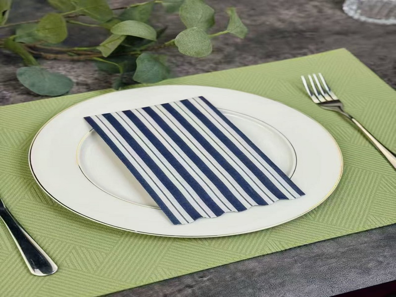 View moreEasy Table Styling: How Die-Cut Napkins Add Instant Holiday CharmWhen it comes to creating a memorable holiday setting, the smallest details often have the greatest impact. Printed die-cut napkins in colors are a simple yet elegant way to elevate any table setting, whether it’s for a festive New Year’s Eve dinner or a family gathering during Chinese New Year. These charming, intricately designed napkins not only serve a practical purpose but also enhance the visual appeal of the table, contributing to a cheerful, holiday atmosphere. The Allure of Die-Cut Napkins Die-cut napkins are a versatile and stylish choice for table decoration. Unlike standard napkins, these feature intricate designs cut out from the material, which adds texture and a decorative flair. Available in various colors, die-cut napkins can be tailored to match any event theme or festive color palette. These napkins come in a variety of forms—some feature elegant floral motifs, others sport geometric patterns or intricate cut-out designs related to the season. For example, during the holiday season, you may find napkins with snowflake patterns, Christmas trees, or even symbols associated with Chinese New Year, such as lanterns or dragons. This wide range of designs means that there is a die-cut napkin suitable for virtually every occasion. Why Choose Printed Die-Cut Napkins for Holiday Events? Instant EleganceDie-cut napkins elevate the dining experience with their sophisticated, artistic appeal. The clean-cut edges and precision of these napkins stand out, making them perfect for both formal and informal settings. Whether it’s a cozy New Year’s dinner or a Chinese New Year feast, these napkins immediately enhance the ambiance of your table. Customization for Every OccasionPrinted die-cut napkins in colors offer endless customization options. From vibrant hues for springtime gatherings to more muted tones for fall or winter celebrations, die-cut napkins can be designed to complement any theme. For instance, red and gold die-cut napkins are perfect for Chinese New Year, while silver or white designs with snowflakes would bring out the festive charm for a Christmas dinner. Practical Yet DecorativeApart from their aesthetic appeal, die-cut napkins are also highly practical. The soft texture of these napkins makes them functional for cleaning and wiping, while their intricate designs add to the visual interest. They offer the perfect combination of beauty and utility, making them a go-to choice for event planners and homeowners alike. Versatile UsePrinted die-cut napkins are not limited to just one use. They can be used at the dining table as part of a place setting, but they can also double as creative party favors. For example, a small die-cut napkin can be tied with a ribbon to create a personal gift for guests, adding a thoughtful touch to the gathering. How to Incorporate Die-Cut Napkins into Your Holiday Decor Incorporating die-cut napkins into your holiday table styling is an easy and fun process. Here are a few tips for ensuring your napkins fit seamlessly into your holiday theme: Match the Color Scheme Select printed die-cut napkins that complement your holiday color palette. During New Year’s Eve, metallic hues such as gold, silver, and black are popular, while for Chinese New Year, red and gold are classic choices. Make sure the napkins blend with the overall table setting—whether you’re using matching plates, tablecloths, or centerpieces. Layer for Impact Die-cut napkins look stunning when layered with simple cloth napkins. A solid-colored napkin beneath a die-cut napkin creates a striking contrast that highlights the cut-out design. Experiment with different textures to create depth and interest on the table. Fold with Flair The way you fold your die-cut napkins also affects the overall look. For added flair, consider folding the napkin into a shape that complements the cut-out design, like a Christmas tree or a fan shape. A unique fold can make the napkin stand out as the focal point of the table setting. Incorporate Into Place Settings Die-cut napkins can also be used as part of your place settings. Placing each napkin on top of the plate, either neatly folded or artfully arranged, will set the tone for the meal. The napkins can be the perfect accent to formal place cards or themed menus. Popular Die-Cut Napkin Designs for Different Holidays Chinese New Year: Napkins featuring lanterns, dragons, or the Chinese character for “fortune” add a cultural touch to your table. Red and gold colors bring good luck and prosperity for the New Year. Christmas and New Year: Snowflakes, Christmas trees, and reindeer designs are timeless. Colors like red, white, gold, and silver are perfect for these winter holidays. Spring Festivals: Floral patterns, butterflies, and soft pastel colors make die-cut napkins ideal for spring gatherings, such as Easter brunches or birthday parties. Benefits of Using Die-Cut Napkins Benefit Description Customization Die-cut napkins can be tailored to suit the specific colors and theme of any event. Elegant Presentation The intricate designs add a sophisticated and artistic touch to your table setting. Practicality Soft and absorbent, die-cut napkins serve as both functional and decorative items. Versatility These napkins can be used for a variety of holidays and events, from Christmas to birthdays and beyond. Budget-Friendly Die-cut napkins are an affordable way to add a personal touch to your event decor. How to Care for Die-Cut Napkins Proper care will ensure that your die-cut napkins last for multiple events and occasions. To maintain their delicate cut-out designs, avoid heavy washing or scrubbing. It’s recommended to hand wash or machine wash on a gentle cycle using mild detergent. Air dry to prevent any shrinking or misshaping of the fabric. FAQ Q1: What materials are die-cut napkins made from?Die-cut napkins are typically made from high-quality paper or fabric. Paper napkins are more common for disposable use, while fabric napkins offer a more luxurious feel and are reusable. Q2: Are die-cut napkins suitable for all types of events?Yes, die-cut napkins can be used for various occasions, including holiday dinners, weddings, and formal events. Their customizable designs make them a versatile choice for any celebration. Q3: How do I choose the right die-cut napkins for my event?Consider the theme and color scheme of your event. Printed die-cut napkins in colors that complement your décor will create a cohesive look. Look for designs that match the occasion, whether it’s winter holidays, spring gatherings, or other celebrations. Q4: Can I use die-cut napkins for outdoor events?Yes, die-cut napkins can add a touch of charm to outdoor picnics, barbecues, or garden parties. Choose durable paper napkins or opt for fabric napkins for a more sustainable choice. Q5: Where can I purchase die-cut napkins?Die-cut napkins are available from a variety of retailers, both online and in stores. Specialty party supply shops and event planning websites often carry a wide selection of designs and colors. Conclusion Die-cut napkins are more than just practical dining accessories—they are a fun, decorative way to enhance the mood of any holiday event. Whether you’re hosting a festive Christmas dinner or a lively Chinese New Year celebration, these intricately designed napkins can add a touch of elegance and charm to your table setting. With endless customization options in terms of color, design, and theme, they offer an easy way to transform an ordinary dinner into an extraordinary occasion.2026-02-12+
 -
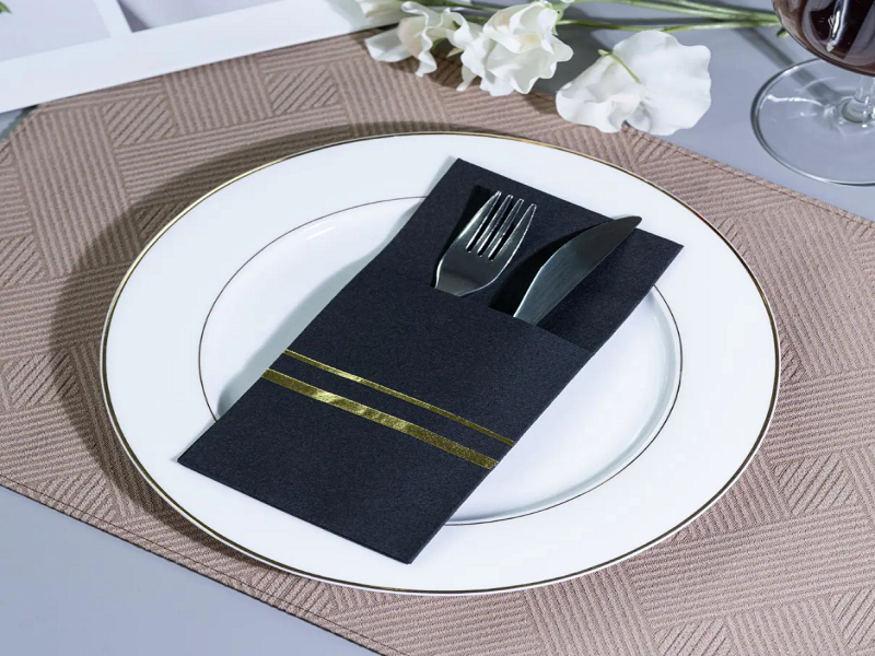 View moreHow to Style Your Table with Colored Airlaid Napkins for a Stunning Look?When it comes to setting a beautiful table, the details matter. One element that can elevate your table setting instantly is colored airlaid napkins. Known for their luxurious texture and versatile design, airlaid napkins are a favorite in both casual and formal dining settings. Understanding Colored Airlaid Napkins Before diving into styling tips, it’s important to understand what colored airlaid napkins are and why they’re a popular choice for table settings. Airlaid napkins are made from fibers that are bonded together without the need for a woven structure, giving them a soft, linen-like feel. Unlike regular paper napkins, airlaid napkins are durable, absorbent, and offer a refined appearance. Colored airlaid napkins come in a variety of hues, making them perfect for adding personality and flair to any dining occasion. Whether you’re hosting a formal dinner party or a casual family gathering, these napkins can match any theme or decor. Choosing the Right Color for the Occasion The color of your napkins plays a significant role in setting the tone of the event. Different colors evoke various moods, and choosing the right shade can create the desired atmosphere. Classic White or Ivory: For a timeless and elegant look, classic white or ivory airlaid napkins are ideal. They complement any color palette and work well for formal events such as weddings or upscale dinner parties. Bold Colors: Bright hues like red, yellow, and blue can inject energy and vibrancy into your table setting. These are perfect for festive occasions like birthdays, holidays, or casual gatherings with friends. Pastels: Soft pastels such as blush pink, lavender, and mint green are perfect for spring or summer events. They add a delicate touch, making them ideal for brunches, baby showers, or garden parties. Dark Tones: Deep shades like navy, burgundy, or charcoal create a sophisticated, modern look. These colors work well in fall or winter settings, or for upscale dinner parties. By choosing the appropriate color for your colored airlaid napkins, you can easily match your napkins to your event’s theme or color scheme. Folded Napkin Techniques to Enhance the Table Napkin folding is an art form that can significantly enhance your table’s aesthetic. The way you fold your colored airlaid napkins can create a dramatic effect, adding sophistication and flair. Here are a few folding techniques to consider: The Classic Rectangular Fold: Simple yet elegant, the rectangular fold is perfect for any occasion. Simply fold the napkin in half to create a long, rectangular shape, and place it neatly on each plate. The Fan Fold: This fold is ideal for adding visual interest. Fold the napkin accordion-style, then fan it out slightly to create a soft, cascading effect that adds texture and style to your table. The Pouch Fold: For a more creative touch, the pouch fold is an excellent option. It gives the appearance of a small pouch, which can be filled with cutlery or decorative elements like small flowers or beads. The Fleur-de-Lis Fold: This intricate fold resembles the shape of a flower and adds an air of refinement to any table setting. It’s perfect for formal events or weddings. You can also experiment with using colored airlaid napkins in a variety of folds on a single table for added interest. Pairing Colored Airlaid Napkins with Other Tableware One of the best ways to make your colored airlaid napkins stand out is by pairing them with the right tableware. The napkins should complement the plates, glassware, and cutlery on your table. Tablecloths and Runners: If you’re using a tablecloth, consider selecting a neutral or complementary color that enhances the napkins. For example, ivory napkins paired with a dark brown or black tablecloth can create a dramatic contrast. A patterned table runner can add depth and texture to the setting. Plates and Bowls: Opt for simple white plates if you’re using bold-colored napkins, or match pastel-colored napkins with plates in similar shades for a cohesive look. Darker napkins can be paired with metallic plates or matte finishes to create a modern, chic setting. Glassware and Cutlery: Crystal glassware and polished silverware elevate the overall appearance of your table. Metallic-toned cutlery, such as gold or silver, pairs beautifully with dark or bright-colored napkins. Seasonal Themes and Events Colored airlaid napkins can be easily adapted to different seasons and events, making them a versatile option for all-year-round styling. Spring and Summer: Light pastel colors like pale blue, peach, or mint green are perfect for casual outdoor settings, barbecues, and picnics. Pair them with fresh flowers and simple glassware for a laid-back, fresh look. Autumn and Winter: Darker shades such as burnt orange, rich purple, or dark green are ideal for colder months. Pair these with earthy tones, wooden elements, and warm-colored tableware to create a cozy, inviting atmosphere. Festive Occasions: Bright reds, golds, and greens are perfect for holiday dinners, Christmas parties, or New Year’s Eve celebrations. These colors can be paired with metallic or glass ornaments, candles, and elegant serving dishes for a luxurious feel. Weddings and Formal Events: Soft neutrals such as blush pink, gold, and silver can create a romantic and sophisticated vibe. These colors work wonderfully with candles, floral centerpieces, and formal dinnerware. Creating a Balanced and Elegant Setting Balance is key when designing a table setting with colored airlaid napkins. You want the napkins to stand out, but they should not overwhelm the rest of the table. Start by choosing a color palette that suits the overall vibe of the event. If you’re using bold-colored napkins, keep other elements like tablecloths and plates in neutral tones to allow the napkins to be the focal point. Alternatively, if you’re using softer colors for the napkins, consider incorporating patterned or textured elements into the tableware to create a balanced look. Using Colored Airlaid Napkins for Special Effects Besides folding, colored airlaid napkins can also be used creatively for other decorative elements on the table. Consider these ideas for adding an extra touch of elegance: Napkin Rings: Napkin rings are an excellent way to dress up your napkins. Choose rings that complement the napkin’s color, such as gold or silver rings for a formal event, or rustic wooden rings for a more casual setting. Napkin Bouquets: For a creative twist, arrange multiple napkins in a bouquet shape and place them in a vase or holder in the center of the table. Monogrammed Napkins: For a personalized touch, consider using monogrammed colored airlaid napkins for special occasions like weddings or family gatherings. The custom touch will add a personal flair to your event. Conclusion Colored airlaid napkins offer a simple yet effective way to transform your table setting, whether you’re hosting a formal dinner or a casual brunch. By selecting the right colors, experimenting with various folds, and pairing them with complementary tableware, you can create a visually appealing and elegant atmosphere that will impress your guests. These napkins are not only practical but also add a touch of sophistication and style to any dining occasion. FAQ Q1: What are colored airlaid napkins made of?Colored airlaid napkins are made from bonded cellulose fibers that create a soft, linen-like texture. They are highly absorbent and durable, making them a more refined option than traditional paper napkins. Q2: Can colored airlaid napkins be used for outdoor events?Yes, colored airlaid napkins are perfect for outdoor events. Their durability and elegant appearance make them a great choice for picnics, barbecues, and garden parties. Q3: How do I clean colored airlaid napkins?Colored airlaid napkins are disposable, so they are meant to be used once. However, some high-quality airlaid napkins may be reusable if carefully washed, depending on their material and design. Q4: Are colored airlaid napkins suitable for weddings?Yes, colored airlaid napkins are an excellent choice for weddings. You can select soft pastel shades for a romantic look or bold colors for a more festive atmosphere. Q5: How do I choose the right color for my table setting?The best color for your colored airlaid napkins depends on the theme and mood you want to create. Neutral tones work well for formal events, while bright or pastel colors are perfect for casual or seasonal occasions.2026-02-05+
 -
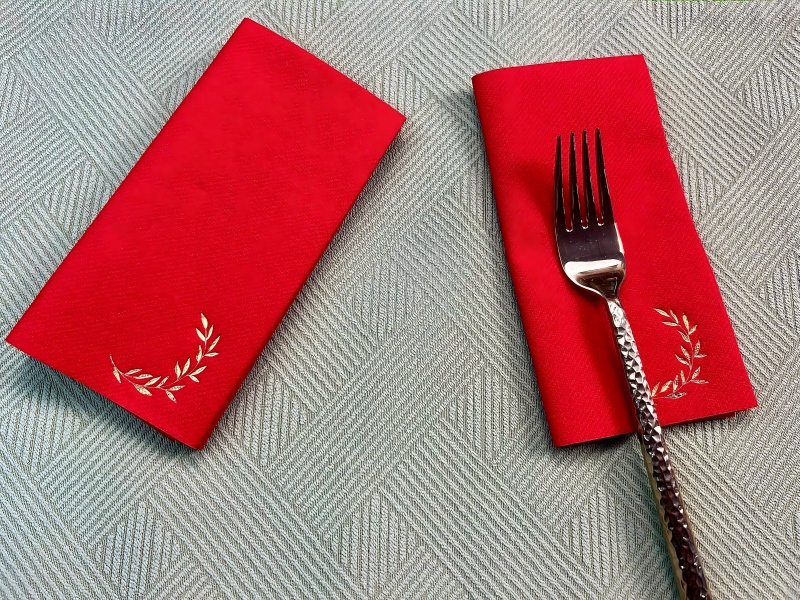 View moreHow Are Airlaid Napkins Manufactured and What Makes Them Unique?In the fast-evolving world of disposable tableware, airlaid napkins have carved a distinct niche. They are increasingly preferred in hospitality, catering, and home settings due to their superior texture, absorbency, and presentation appeal. Unlike traditional paper napkins, airlaid napkins offer a combination of strength, softness, and design flexibility that meets modern consumer expectations. Understanding Airlaid Napkins Airlaid napkins are produced using a unique airlaid technology. This process involves distributing short wood fibers into an air stream to form a uniform web, which is then bonded using chemical or thermal binders. This differs from conventional paper production, where fibers are suspended in water and drained to form sheets. The result is a thicker, softer, and highly absorbent napkin capable of withstanding liquids and maintaining shape. Airlaid napkins are widely used in catering, fine dining, and cocktail settings. Variants such as cocktail airlaid paper napkins are smaller in size, typically designed for beverages, hors d’oeuvres, and casual gatherings, but they carry the same premium qualities as larger napkins. The Airlaid Manufacturing Process The manufacturing process of airlaid napkins is technically sophisticated and requires specialized equipment. Below is a breakdown of the typical stages: Fiber Preparation Raw materials, typically pulp or cellulose fibers, are first cleaned and fluffed. This ensures uniform fiber length and removes impurities that could compromise napkin quality. For cocktail airlaid paper napkins, finer fibers may be used to achieve a softer touch suitable for delicate usage. Airlaid Web Formation Prepared fibers are introduced into an air stream. The fibers are distributed evenly over a moving belt, forming a loose web. Unlike traditional paper sheets, no water is used in this stage, making the web lightweight but voluminous. Binding and Bonding The web is then bonded to maintain structural integrity. Common methods include: Thermal bonding: Applying heat to thermoplastic binders within the fibers. Chemical bonding: Spraying the web with a binder solution that dries to hold fibers together. Calendering Calendering smooths and compresses the web to achieve uniform thickness and a soft surface. This step is crucial for napkins that will undergo hot stamping, as a smooth surface ensures clean prints. Printing and Hot Stamping Airlaid napkins are highly compatible with printing techniques, including hot stamping. Hot stamping involves transferring a metallic or colored foil onto the napkin using heat and pressure. This allows intricate designs, logos, or patterns to be applied, enhancing visual appeal for special events or premium presentations. Cutting, Folding, and Packaging After bonding and finishing, the large airlaid sheets are cut into the desired napkin size. Folding machines create various styles, including cocktail folds, multi-fold designs, or rolled formats. Napkins are then packaged for distribution. Comparison with Regular Paper Napkins Airlaid napkins differ significantly from traditional paper napkins in terms of structure, performance, and aesthetics. The following table highlights key distinctions: Feature Airlaid Napkins Regular Paper Napkins Texture Soft, cloth-like Thin, rough Absorbency High, holds liquids without disintegration Moderate, can tear when wet Strength Strong, resists tearing even when wet Weaker, prone to tearing Thickness Voluminous, fluffy Flat, less cushion Design Options Hot stamping, embossing, printing Limited printing, minimal embossing Cost Higher production cost Lower production cost Use Cases Catering, cocktail parties, premium dining Everyday casual use Advantages of Airlaid Napkins The rising popularity of airlaid napkins is linked to several advantages over conventional napkins: Enhanced Absorbency: Airlaid napkins can absorb multiple times their weight in liquid without losing shape, making them ideal for messy or beverage-centric occasions. Premium Feel: The soft, cloth-like texture elevates the dining experience, contributing to perceived quality and sophistication. Durability: They maintain structural integrity even when wet, reducing the likelihood of tears or disintegration during use. Customizable Designs: Techniques such as hot stamping allow intricate designs, logos, and branding elements to be applied directly to napkins, making them suitable for upscale events or corporate functions. Environmental Considerations: Many airlaid napkins are made from renewable pulp fibers and can be fully biodegradable, aligning with sustainable product trends. Specialized Variants: Cocktail Airlaid Paper Napkins Cocktail airlaid paper napkins are a specialized subset. These napkins are smaller in size but share the same high-quality airlaid construction. Their compact dimensions make them suitable for serving beverages, finger foods, and hors d’oeuvres at events. The manufacturing process mirrors standard airlaid napkins but with additional precision in folding and cutting to suit beverage service. Cocktail airlaid paper napkins are often sold in packs with decorative prints or hot-stamped designs, enhancing table presentation. Their softness, absorbency, and design versatility make them a preferred choice for bars, hotels, and upscale catering services. Quality Control in Airlaid Napkin Production Quality control is essential in the airlaid napkin industry to maintain consistent performance. Critical checkpoints include: Fiber quality: Ensuring uniformity, strength, and cleanliness. Web uniformity: Monitoring thickness, density, and even distribution. Bonding strength: Testing resistance to tearing and absorbency under stress. Finishing precision: Checking print, embossing, and hot stamping accuracy. Packaging integrity: Ensuring folds, packs, and presentation meet client requirements. Automated monitoring systems are commonly used to detect irregularities during production, ensuring each napkin meets high standards of performance and aesthetics. Applications Beyond Dining While airlaid napkins are predominantly associated with dining and catering, they also find applications in other sectors: Event planning: Wedding receptions, cocktail parties, and conferences. Hospitality: Hotels, resorts, and airlines often use airlaid napkins for a premium guest experience. Corporate branding: Custom-printed airlaid napkins with hot stamping can reinforce brand identity. Home use: Premium households favor them for their comfort, absorbency, and upscale appearance. Trends Driving Airlaid Napkin Adoption Several trends contribute to the growing adoption of airlaid napkins: Premiumization of Disposable Products: Consumers increasingly prefer disposable items that mimic the feel of reusable cloth. Sustainability: Airlaid napkins made from biodegradable pulp appeal to environmentally conscious buyers. Customization: Hot stamping and embossing allow for bespoke designs for events and branding. Convenience: Single-use napkins reduce cleaning efforts without compromising quality or presentation. Key Considerations for Buyers When selecting airlaid napkins, consider the following: Fiber Type: Soft pulp fibers improve texture and absorbency. Thickness: Thicker napkins provide a more luxurious feel and superior absorbency. Printing Capability: Ensure compatibility with hot stamping or custom printing. Size and Fold Type: Choose sizes appropriate for intended use, such as standard dining or cocktail napkins. Environmental Impact: Verify biodegradability and certifications for eco-friendly products. Airlaid Napkins vs Other Premium Alternatives Airlaid napkins are often compared with other high-quality disposable napkins like tissue-based or embossed paper napkins. The table below summarizes these comparisons: Feature Airlaid Napkins Tissue Napkins Embossed Paper Napkins Texture Soft, cloth-like Soft, thin Rougher, limited softness Absorbency High Moderate Moderate Strength (wet) High Low Low Design Options Hot stamping, embossing Limited printing Embossing only Cost Higher Lower Medium Presentation Appeal Premium Basic Moderate This comparison reinforces why airlaid napkins, particularly cocktail airlaid paper napkins, are the preferred choice for premium dining experiences. Conclusion Airlaid napkins represent a blend of innovation, functionality, and design flexibility. Their unique airlaid production process, combined with bonding, calendering, and finishing techniques such as hot stamping, ensures a product that is soft, absorbent, strong, and visually appealing. By understanding the production process and unique advantages of airlaid napkins, buyers and suppliers can better appreciate their value in both practical and aesthetic terms. FAQ 1. What are airlaid napkins made of?Airlaid napkins are primarily made from pulp or cellulose fibers, distributed into an air stream and bonded with thermal or chemical binders to form a soft, strong, and absorbent sheet. 2. How do cocktail airlaid paper napkins differ from regular airlaid napkins?Cocktail airlaid paper napkins are smaller and designed specifically for serving beverages and appetizers. They maintain the same soft texture, absorbency, and design flexibility. 3. What is hot stamping, and why is it used on airlaid napkins?Hot stamping is a printing process that transfers foil onto the napkin using heat and pressure. It allows intricate designs, logos, and metallic accents, enhancing the visual appeal. 4. Are airlaid napkins environmentally friendly?Yes, most airlaid napkins are made from renewable pulp fibers and are biodegradable, aligning with sustainable practices. 5. Why choose airlaid napkins over regular paper napkins?Airlaid napkins offer superior softness, absorbency, strength, and design versatility, making them ideal for premium dining, catering, and special events.2026-01-28+
 -
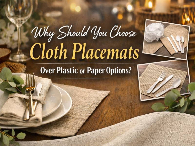 View moreWhy Should You Choose Cloth Placemats Over Plastic or Paper Options?In today’s world, placemats are a common yet important part of dining table settings. They serve both aesthetic and functional purposes, from protecting tabletops to enhancing the overall dining experience. Among the various types of placemats available, cloth placemats stand out as the most versatile and sustainable option compared to plastic or paper alternatives. Durability and Longevity When it comes to placemats, one of the most important factors to consider is durability. Cloth placemats, made from high-quality fabrics, are built to last. Unlike paper placemats, which are single-use, or plastic placemats that may lose their shape over time, cloth placemats maintain their integrity after multiple washes. They don’t fade easily, and with proper care, they can last for many years, making them a more cost-effective choice in the long run. In fact, premium cloth placemats are often crafted from high-density fabrics that resist wear and tear. Whether used in a hotel, restaurant, or for personal events, cloth placemats are an investment that pays off over time. Eco-Friendly and Sustainable One of the most compelling reasons to choose cloth placemats is their eco-friendliness. Paper placemats contribute significantly to waste, as they are single-use items, while plastic placemats, although durable, are made from petroleum-based materials that take centuries to decompose. In contrast, cloth placemats are reusable and long-lasting, reducing the need for constant replacements. By choosing cloth placemats, you are making a conscious decision to reduce your environmental footprint. Many cloth placemats are made from natural materials such as cotton or linen, which are biodegradable and can be washed and reused multiple times. Additionally, these materials are often produced using sustainable practices, making them an even more attractive option for eco-conscious consumers. Comfort and Texture Cloth placemats offer a level of comfort and texture that plastic and paper options simply can’t match. The softness of cloth provides a more pleasant experience for diners, especially during long meals. Cloth placemats, unlike their plastic counterparts, do not feel cold or uncomfortable to the touch. The fabric can also absorb excess moisture, preventing condensation from cold drinks from forming unsightly rings on the table. Moreover, cloth placemats come in a variety of textures and patterns, adding a touch of elegance to any dining occasion. Whether you’re hosting a formal event or a casual family dinner, cloth placemats can complement the overall aesthetic of your table setting. From fine linen to cotton blends, these placemats provide a natural look that enhances the dining environment. Versatility in Design and Style Cloth placemats offer versatility in design, something that plastic or paper alternatives cannot match. Available in a wide range of colors, patterns, and styles, cloth placemats can be customized to suit the theme of any occasion. Whether you’re planning a wedding, a corporate event, or a casual family dinner, you can find cloth placemats that perfectly match the color scheme and ambiance of your space. Additionally, cloth placemats can be easily embroidered or printed with logos, names, or custom messages, making them ideal for hotels, restaurants, and other businesses looking to add a personal touch to their table settings. Customizing your cloth placemats also allows you to create a consistent and professional image for your brand, which can enhance customer experiences. Easier Maintenance Cloth placemats are easier to maintain compared to plastic and paper alternatives. While plastic placemats may require constant wiping and may develop scratches over time, cloth placemats can simply be washed, making them a more convenient option for busy households or businesses. Modern washing machines and detergents can easily remove stains and dirt from fabric placemats, ensuring they look fresh and clean for every meal. For those worried about the maintenance of cloth placemats, most high-quality options are designed to be stain-resistant and fade-resistant, meaning they can maintain their vibrant appearance even after multiple washes. Improved Dining Experience Beyond their functional benefits, cloth placemats contribute to an elevated dining experience. Their softness, elegance, and luxury help create a more comfortable and sophisticated atmosphere at the dining table. Whether in a restaurant or a private home, cloth placemats enhance the overall aesthetic, making meals feel more special. In hotels and restaurants, premium cloth placemats can add a touch of class, making guests feel valued and enhancing their dining experience. The texture and appearance of a cloth placemat can create a more refined setting that is hard to achieve with disposable plastic or paper placemats. Cost-Effective in the Long Run While cloth placemats may have a higher upfront cost than their plastic or paper counterparts, they are more cost-effective in the long run. Cloth placemats are durable and reusable, reducing the need for frequent replacements. On the other hand, paper placemats are disposable, and businesses or households would need to purchase new placemats regularly, which can add up over time. Similarly, plastic placemats may wear down, become scratched, or lose their appeal after extended use. By investing in cloth placemats, you save money in the long term and reduce waste, making it a smart choice both economically and environmentally. Product Comparison: Cloth vs. Plastic vs. Paper Placemats Feature Cloth Placemats Plastic Placemats Paper Placemats Durability High, long-lasting Moderate, may scratch Low, single-use Eco-Friendliness High, reusable Low, not biodegradable Very low, disposable Comfort Soft, comfortable Hard, uncomfortable Thin, flimsy Aesthetic Appeal Elegant, versatile Basic, limited style Minimalistic, disposable Maintenance Easy to wash Easy to wipe Disposable, no maintenance Cost (Over Time) Cost-effective long-term Moderate long-term Expensive in the long run FAQ 1. How often should I wash cloth placemats? Cloth placemats should be washed after every few uses, depending on how messy the meals are. They can easily be machine-washed or hand-washed, and most high-quality cloth placemats are resistant to stains and fading. 2. Are cloth placemats suitable for outdoor use? Yes, cloth placemats can be used outdoors. However, it’s important to choose placemats made from durable, water-resistant fabrics if you plan to use them outside frequently. 3. Can I customize my cloth placemats with logos or designs? Absolutely! Cloth placemats can be embroidered or printed with logos, names, or custom designs, making them ideal for restaurants, hotels, and events where personalization is important. 4. Are cloth placemats more hygienic than plastic or paper? Yes, cloth placemats can be washed and sanitized more thoroughly compared to plastic or paper placemats. They also don’t trap dirt or germs in the way plastic placemats do. 5. How do cloth placemats compare to paper in terms of cost? While cloth placemats may have a higher initial cost, they are more cost-effective in the long run because they can be reused, whereas paper placemats are disposable and require constant repurchasing. The cloth placemats offer a host of benefits that plastic and paper placemats simply can’t match. From their durability and eco-friendliness to their aesthetic appeal and ease of maintenance, cloth placemats are a smart and sustainable choice for any dining setting. Whether you’re outfitting a hotel, a restaurant, or hosting an event at home, cloth placemats provide long-lasting value and a refined dining experience that elevates any occasion.2026-01-22+
 -
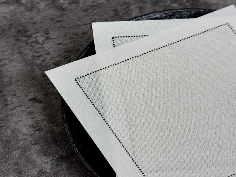 View moreWhat Are the Key Benefits of Using Cloth Napkins Over Paper Napkins?Introduction In today’s world, napkins are an essential part of dining experiences, whether at home, restaurants, or events. While paper napkins are widely used due to their convenience and cost-effectiveness, cloth napkins offer several significant benefits that paper alternatives cannot match. Environmental Impact: The Sustainability of Cloth Napkins One of the primary reasons to opt for cloth napkins is their environmental impact. Paper napkins are single-use items, meaning they contribute to significant waste. In contrast, cloth napkins are reusable, which reduces the need for constant manufacturing and disposal. The production of paper napkins requires large amounts of water, energy, and natural resources, which further exacerbates environmental concerns. On the other hand, cloth napkins can be used repeatedly, leading to a smaller environmental footprint. Zhejiang Huzhou Shuangjie Paper Co., Ltd. takes this a step further by promoting sustainable alternatives, such as high-quality cloth napkins made from eco-friendly materials, contributing to a more sustainable dining experience. Environmental Comparison Between Cloth and Paper Napkins Factor Cloth Napkins Paper Napkins Reusability Yes, can be used multiple times No, single-use item Environmental Impact Low, reduces waste and resource use High, contributes to deforestation Manufacturing Energy Minimal, especially for organic fibers High, requires extensive energy Water Consumption Low, can be washed in bulk High, required for pulp production Enhanced Aesthetics and Elegance Cloth napkins bring an unparalleled level of elegance to any dining setting. Whether in a high-end restaurant or a casual family gathering, the texture and presentation of a cloth napkin immediately elevate the dining experience. In contrast, paper napkins often appear cheap or disposable, detracting from the overall ambiance. Cloth napkins, particularly in a pristine white color, can complement a wide range of table settings and themes, from formal banquets to more relaxed social events. Zhejiang Huzhou Shuangjie Paper Co., Ltd. offers customizable white cloth napkins that cater to businesses seeking to enhance their branding while maintaining an elegant and sophisticated image. Advantages of White Cloth Napkin: Adds a touch of luxury to any meal. Ideal for any event, from casual coffee shops to formal dinners. Offers flexibility in matching various tablecloths and dinnerware. Cost-Effectiveness in the Long Run Although cloth napkins may come with a higher upfront cost, they prove to be more cost-effective over time. With proper care, a cloth napkin can be reused hundreds of times. In contrast, paper napkins need to be replaced after every use, leading to ongoing purchasing costs. Over a year, the cost of paper napkins can quickly accumulate, while cloth napkins are an investment that can save money in the long term. Hygiene and Cleanliness: The Practical Benefits From a hygiene perspective, cloth napkins offer better protection and cleanliness compared to paper napkins. With a cloth napkin, you avoid the risk of the paper tearing, leaving bits behind. Cloth napkins are also more absorbent and can wipe away spills more effectively. In the foodservice industry, using cloth napkins can signal professionalism and attention to detail, as guests can see that every aspect of their experience has been thought through with care. Hygiene Comparison Between Cloth and Paper Napkins Factor Cloth Napkins Paper Napkins Absorbency High, absorbs liquids and oils Moderate, may tear or shred Durability Strong, can handle multiple uses Fragile, prone to tearing Freshness Maintained with regular washing May carry residual chemicals or inks Versatility and Customization Cloth napkins offer greater versatility than paper napkins. They can be folded into various shapes and designs to enhance the overall table setting. Moreover, cloth napkins can be personalized with embroidery or printing, such as logos for brand promotion, which paper napkins cannot provide in the same high-quality manner. This customization adds a personal touch to any meal, event, or celebration, making it unique and memorable. Advantages of Customizable Cloth Napkins: Perfect for branding in restaurants, hotels, and events. Can be used for weddings, parties, and corporate events with logos or messages. Available in various colors, patterns, and fabrics for a tailored experience. Practical Applications and Uses Cloth napkins are suitable for a wide range of occasions, including but not limited to: Restaurants & Hotels: High-end dining establishments often prefer cloth napkins for their elegance and reusability. Weddings & Events: Customizable napkins with wedding monograms or event logos are a popular choice. Family Gatherings: Cloth napkins enhance the dining experience at home and reduce waste. Conclusion In conclusion, while paper napkins may serve their purpose in quick, disposable situations, cloth napkins offer numerous benefits, including long-term cost savings, sustainability, hygiene, and aesthetic appeal. Whether you are a business owner looking to improve customer experience or a host planning a memorable event, the switch to cloth napkins is an investment in quality, elegance, and environmental responsibility. FAQ 1. What makes cloth napkins more sustainable than paper napkins?Cloth napkins are reusable, reducing the need for constant paper production and disposal, which helps in conserving natural resources. 2. Can cloth napkins be used for both casual and formal events?Yes, cloth napkins are versatile and can be customized to match any event, from casual family dinners to upscale corporate events. 3. Are cloth napkins more hygienic than paper napkins?Yes, cloth napkins are more absorbent, durable, and provide a better cleaning surface compared to paper napkins, reducing the risk of debris or paper residue. 4. Can I personalize cloth napkins for my business or event?Absolutely. Cloth napkins can be embroidered or printed with logos, names, or messages, making them a perfect choice for brand promotion. 5. How do I maintain cloth napkins?Cloth napkins can be washed and reused, making them easy to maintain and ensuring they stay fresh after each use.2026-01-16+
 -
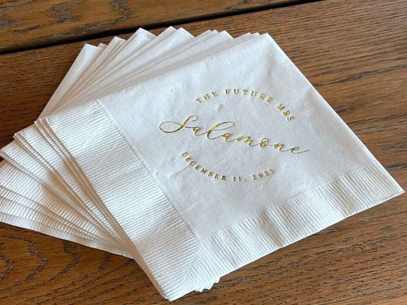 View moreLooking for the Perfect Holiday Table Setting? Are Airlaid Napkins the Answer?The holiday season is a time for celebration, togetherness, and of course, great food. But a successful holiday dinner isn’t just about what’s on the plate — the way the table is set plays an equally important role in creating a memorable dining experience. From the centerpiece to the dinnerware, every detail counts. Among these elements, one often-overlooked yet essential item is the napkin. What Are Airlaid Napkins? Airlaid napkins are crafted from fibers that are bonded together using air rather than traditional methods like weaving or knitting. This process produces a napkin that mimics the softness of fabric but maintains the convenience of paper. Airlaid napkins are soft, absorbent, durable, and generally more elegant than standard paper napkins. The manufacturing process for airlaid napkins involves laying out fibers on a conveyor belt using air, which are then bonded through a heat press. The result is a product that’s smoother and stronger than traditional paper napkins, making it ideal for both formal and festive occasions like holiday dinners. Key Features of Airlaid Napkins Feature Description Benefits for Holiday Dining Material Non-woven fabric made from bonded fibers. Softer than regular paper napkins, providing a luxurious feel at the dinner table. Softness and Comfort Mimics the texture of linen but without the wrinkles. Comfortable to use, ensuring guests feel at ease while dining. Durability Stronger and more absorbent than regular paper napkins. Ideal for handling sauces and spills without tearing or falling apart. Variety of Styles Available in different colors, designs, and patterns. Offers endless possibilities for holiday customization, from festive patterns to elegant, minimal designs. Eco-Friendly Options Can be made from sustainable materials or manufactured with eco-conscious processes. A sustainable option for those looking to reduce their environmental footprint during holiday celebrations. Why Airlaid Napkins Are Ideal for Holiday Celebrations The holiday table setting is an integral part of festive traditions, and the right napkin can elevate the entire dining experience. Airlaid napkins are the ideal choice for the following reasons: Elegance and SophisticationAirlaid napkins have a luxurious look and feel that make them perfect for any special occasion. Their soft, fabric-like texture adds a touch of elegance to the table, which is essential for festive events. Whether you opt for a classic white, traditional red and green, or a more modern design, airlaid napkins instantly enhance the visual appeal of your table setting. Versatility in DesignAirlaid napkins come in a wide variety of colors, patterns, and customizations. For the holiday season, you can select napkins with delicate hot stamping designs that feature gold or silver foil, embossed logos, or even holiday-themed patterns such as snowflakes, holly, or intricate geometric designs. This added touch of personalization makes airlaid napkins perfect for setting a festive tone. Strength and AbsorbencyUnlike typical paper napkins, airlaid napkins offer superior strength and absorbency. Their ability to handle large spills, oils, and sauces without tearing is particularly useful during a holiday feast, where a variety of foods can create messes. Whether you’re serving a savory dish with gravy or a rich dessert with sauce, airlaid napkins ensure your guests are well-prepared. SustainabilityAs more people opt for eco-friendly choices, airlaid napkins provide a sustainable option for holiday gatherings. Many airlaid napkins are produced using recycled fibers or other sustainable practices. Choosing airlaid napkins for your holiday table can help reduce waste, making it an environmentally responsible option without compromising on quality. The Magic of 3-Ply Airlaid Napkins One of the most popular variants of airlaid napkins is the 3-ply design. The term “ply” refers to the number of layers the napkin has, and a 3-ply napkin is made up of three distinct layers that are bonded together. This additional layer offers several advantages: Increased Durability: 3-ply napkins are stronger and more resilient than 1-ply or 2-ply options. They are less likely to tear or fall apart during use, even when dealing with moist or greasy foods. Better Absorbency: With three layers of material, these napkins absorb liquids much more effectively. Whether you’re dealing with sauces, wine spills, or dessert toppings, a 3-ply airlaid napkin will ensure your guests can clean up easily. Luxury Feel: The added layers give the napkin a thicker, more luxurious feel. This is especially important when setting a formal or upscale table for a special occasion. Hot Stamping: A Touch of Personalization for Your Holiday Table One of the most unique and visually striking features of airlaid napkins is the option to add hot stamping. This technique involves pressing a metallic foil or dye onto the napkin’s surface using heat and pressure, creating a raised, embossed design. For the holiday season, hot stamping is an excellent way to add a sophisticated, festive flair to your table setting. Imagine napkins featuring intricate gold snowflakes, shimmering silver designs, or even your family’s name in elegant lettering. The possibilities for customizing your airlaid napkins are endless, and the result is always stunning. Hot stamping is especially effective for creating a high-end look without the cost of linen napkins. Whether you’re hosting a casual gathering or a formal dinner, the addition of hot stamping adds a professional, polished finish to your table. Practical Considerations for Airlaid Napkins at Holiday Gatherings When planning your holiday dinner, practicality is just as important as aesthetics. Airlaid napkins offer several practical benefits that make them the perfect choice for festive dining. No Need for LaunderingUnlike linen napkins, airlaid napkins are disposable. This means no worries about washing or ironing after the meal. After the festive dinner, you can simply dispose of the napkins, saving you time and effort in cleaning up. This is especially helpful when hosting large gatherings, where multiple sets of napkins are often needed. Perfect for Large GatheringsDuring holiday dinners, tables are often crowded with family members and friends. Airlaid napkins are sturdy enough to handle heavy use throughout the meal. Whether your guests are using them for appetizers, mains, or desserts, they’ll remain intact, providing consistent functionality throughout the event. Variety of SizesAirlaid napkins are available in a variety of sizes, which is ideal for different parts of the meal. You can use smaller cocktail-sized napkins for drinks and larger dinner-sized napkins for the main course. This flexibility allows you to maintain a coordinated and stylish look across all stages of your holiday feast. How to Incorporate Airlaid Napkins into Your Holiday Table Setting Now that you know the benefits of airlaid napkins, here are some tips on how to incorporate them into your holiday table setting: Match Napkins to Your Color Scheme: Choose airlaid napkins that complement your overall holiday theme. For example, red and green are classic holiday colors, but you could also opt for gold, silver, or deep blue for a more elegant and understated look. Add a Personal Touch with Hot Stamping: Customize your napkins with festive designs, messages, or even your family name. Hot stamping gives a premium feel and can be used to reflect your personal style. Use Layering for Added Visual Appeal: Consider layering napkins for extra visual impact. For example, place a large airlaid napkin underneath a smaller one, or fold them in unique shapes for an artistic touch. Incorporate Napkin Rings: Enhance the look of your napkins by using elegant napkin rings. These can further elevate the sophistication of the table setting and tie everything together. Conclusion: The Perfect Finishing Touch for Your Holiday Table Airlaid napkins provide the perfect combination of elegance, durability, and practicality for a holiday table setting. With their luxurious texture, superior absorbency, and customizable designs, they offer everything you need to create a memorable and festive dining experience. Whether you’re looking for a simple yet refined napkin or a personalized, hot-stamped design, airlaid napkins can transform your holiday table into something truly special. As you prepare for your holiday dinner, consider choosing airlaid napkins to complement your table décor. With their wide range of colors, styles, and customization options, they’re sure to add a touch of elegance and sophistication to your celebration.2026-01-09+
 -
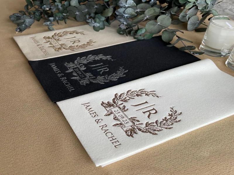 View moreEco-Friendly Hospitality Napkins: Sustainability Trends in the IndustryThe hospitality industry, known for its focus on service and guest experience, has also found itself under increasing scrutiny regarding its environmental impact. With growing consumer demand for sustainable practices and an escalating global awareness of environmental challenges, many sectors within hospitality are exploring eco-friendly alternatives. One area where these shifts are most noticeable is in the use of hospitality napkins. These simple items, often overlooked in terms of their environmental impact, are undergoing a transformation. From raw material choices to production methods and disposal practices, hospitality napkins are becoming a symbol of how sustainability can be integrated into every facet of the hospitality industry. The Need for Sustainability in Hospitality Sustainability has become a key priority for businesses across the globe, particularly in the hospitality sector. Hotels, restaurants, cafes, and event venues are increasingly adopting green policies to reduce waste, conserve water and energy, and lower carbon footprints. Hospitality napkins, which are used in large volumes and often discarded after a single use, present a significant opportunity for these businesses to make a positive environmental impact. Environmental Impact of Traditional Hospitality Napkins Traditional hospitality napkins, usually made from non-recyclable materials or those that require extensive resources to produce, contribute to the growing problem of waste in the hospitality industry. These napkins are typically made from wood pulp or cotton, which, while natural, can involve unsustainable farming practices and excessive water usage. Furthermore, many napkins are bleached with chemicals, a process that produces harmful by-products. The disposal of hospitality napkins is another critical issue. Many of them end up in landfills, where they take years to decompose, releasing methane gas in the process. This not only contributes to landfill waste but also exacerbates the broader environmental crisis. In response to these challenges, the industry is shifting toward more sustainable options. Sustainable Materials in Hospitality Napkins The core of this transformation lies in the materials used to make hospitality napkins. As the demand for eco-friendly solutions increases, manufacturers are turning to alternative materials that are both sustainable and functional. Recycled Paper Napkins Recycled paper napkins are one of the most common sustainable alternatives to traditional paper napkins. By using post-consumer recycled content, these napkins significantly reduce the need for virgin wood pulp, saving trees and minimizing the energy and water usage required for production. Bamboo Napkins Bamboo, a highly renewable resource, is increasingly being used in the production of hospitality napkins. Bamboo grows quickly and requires very little water, making it an ideal alternative to traditional paper or cotton-based napkins. Additionally, bamboo napkins are biodegradable and compostable, reducing their impact when disposed of. Cotton Napkins Cotton napkins are another sustainable choice, particularly when made from organic cotton. Organic cotton farming avoids the use of harmful pesticides and synthetic fertilizers, promoting soil health and biodiversity. These napkins are durable, reusable, and can be washed and used multiple times, further extending their lifecycle and reducing waste. Hemp Napkins Hemp is gaining popularity as a sustainable material for hospitality napkins due to its minimal environmental impact during cultivation. Hemp requires little water, no pesticides, and thrives in poor soil conditions. Hemp napkins are durable, biodegradable, and offer an eco-friendly alternative to traditional materials. Production Methods and Eco-Friendly Practices The production process of hospitality napkins also plays a crucial role in their sustainability. Manufacturers are increasingly adopting environmentally friendly methods to reduce the carbon footprint of napkin production. Energy-Efficient Manufacturing Energy consumption during production is a significant factor in the environmental impact of hospitality napkins. Many manufacturers are now investing in energy-efficient technologies to reduce energy use. This includes switching to renewable energy sources such as solar and wind power and implementing more efficient production techniques to minimize waste and emissions. Water Conservation Water usage in the paper production process is another area where sustainability efforts are being focused. The traditional manufacturing process for paper napkins requires large amounts of water, but new technologies and more sustainable practices are reducing this consumption. Closed-loop water systems and the use of waterless printing techniques are examples of innovations helping to conserve water in the production of hospitality napkins. Chemical-Free Processing As part of the shift toward sustainability, many manufacturers have moved away from the use of harmful chemicals in the production of hospitality napkins. This includes eliminating chlorine bleach, which is commonly used in the whitening process, and replacing it with safer, non-toxic alternatives. This shift not only reduces pollution but also ensures that the napkins are safe for both guests and the environment. The Role of Reusability in Sustainable Hospitality Napkins One of the most effective ways to reduce the environmental impact of hospitality napkins is through the promotion of reusable options. Cloth napkins, particularly those made from organic cotton or bamboo, are an excellent choice for reducing waste. They can be washed and reused many times, making them a cost-effective and eco-friendly solution for businesses in the hospitality sector. Restaurants and hotels are increasingly adopting reusable napkins, especially for events such as banquets or conferences, where large quantities of disposable napkins are typically used. While the initial investment in reusable napkins may be higher, the long-term environmental benefits and cost savings are significant. Waste Reduction and Disposal Practices The way hospitality napkins are disposed of is another important factor in their environmental impact. In the past, many napkins were discarded in regular trash bins, ultimately ending up in landfills. However, as businesses adopt more sustainable waste management practices, there is a growing shift towards composting and recycling. Composting Many eco-conscious venues are now composting their used napkins, particularly those made from natural fibers like cotton, bamboo, or hemp. Composting breaks down organic materials into nutrient-rich soil, diverting waste from landfills and reducing greenhouse gas emissions. Recycling Programs Recycling programs that include hospitality napkins are becoming more common, especially for napkins made from recycled paper. Businesses can set up dedicated recycling bins for paper napkins and ensure that they are collected and processed properly. Comparison of Eco-Friendly Hospitality Napkin Materials Material Sustainability Benefits Durability Disposal Method Recycled Paper Reduces need for virgin pulp, saves trees Moderate Recyclable Bamboo Fast-growing, water-efficient, biodegradable High Biodegradable Organic Cotton No pesticides, reduces soil degradation High (reusable) Compostable Hemp Low water use, no pesticides High Biodegradable FAQ 1. What are hospitality napkins made from? Hospitality napkins are typically made from paper, cotton, bamboo, or hemp. These materials vary in sustainability, with bamboo and hemp being some of the most eco-friendly options due to their low environmental impact during production. 2. Can hospitality napkins be recycled? Yes, many hospitality napkins, particularly those made from recycled paper, are recyclable. It’s important to ensure that they are disposed of in designated recycling bins for proper processing. 3. Are there reusable options for hospitality napkins? Yes, cloth napkins made from organic cotton or bamboo are durable, reusable, and environmentally friendly. These napkins can be washed and used many times, making them a great choice for sustainable practices.2026-01-01+
Message Us Right Now!
Address: Tianyuan Road 18, Baishuiwan Industry Park, Tianhuangping Town,
Anji County,Zhejiang Province
- Contact
-
+86-18205820793lydia@shuangjiepaper.comPhone
- Get Connected

